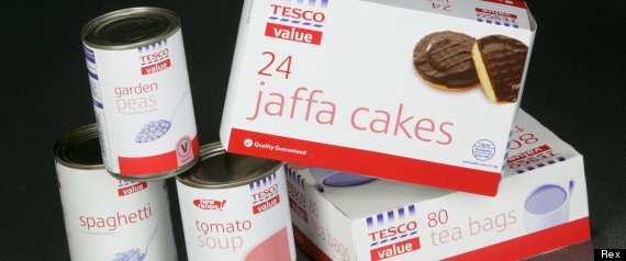
c.1993-April 2012
Tesco has swapped its iconic Value range for the all-new all-crappy Everyday Value |
| "Look this is the cheap one!" |
 |
| Just another product. |
It is, in my opinion at least, a sad day for decent, clear design. The classic blue and white stripes were easily identifiable and clearly said "look this is the cheap one! You want to save money? Buy me!" Its replacement, Everyday Value, is bang on packaging trend with its vaduely natural brown-paper look, but that's where its problem lies- it blends in. I also don't think much of the design aesthetically, it's cluttered and confusing with its little drawings of vaguely related stuff. In the words of Angela Wright, colour psychologist, "blue and white stripes were to the point, blue communicates reliability, trustworthiness, clarity. But these colours are all over the place; there's no recognisable message. Customers learn a colour strategy and what it means, and they become quite discombobulated [brilliant word] if it changes."
Value was an icon, Tesco need to realise this- I can't see the new range being recycled humorously like value has been:
 |
| Joke card |
Oi! Tesco, sort yourselves out.
And so I'm starting a little campaign thing- to ressurect the brand- it's quite simple, I want you to print these onto some sticker paper, write in the names of products, go to your local Tesco's and go mental on all the everyday value products! And whilst you're at it, stick one of these to the front door of the shop!More:
BBC
Independent (which is where the Angela Wright quote was found)


